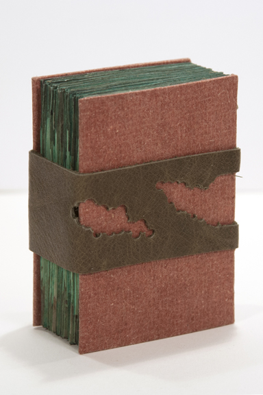
The final intellectual collaboration project of 2011 with Kristin at Space Paste Press is one that is slightly different than the former projects. Instead of using text or image to convey our idea, this December project would rely on the use of materials to translate meaning. This altered the way we had to think about the materials we selected and how they were put together.
I began my paper selection only after I realized that I wanted to play with the way that paper absorbs ink and paint. Since I knew I would be getting the paper wet and possibly soaking it, I decided to use a heavier handmade paper that would stand up to the moisture with a limited amount of movement while drying.
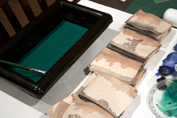
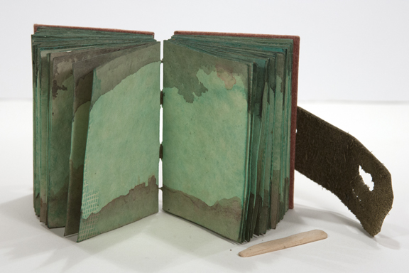
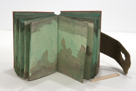
The hope was that I would get some dynamic bleeds across the paper that simulated an organic growth similar to clouding. I sprayed the paper before setting them in the black ink in hopes that it would encourage it to spread more readily. I was pretty happy with the first results. There was a lot of variation in each paper…some ink stayed towards the bottom, some of it reached across the width of the page. I was only disappointed that there was not more saturation of color, which I am sure was due to the amount of water I added to the ink.
I was hoping to achieve a richer decorative pattern so I decided to soak the other side of the paper in a colored ink, orange. My thought was that a color on the other side of the page could create an interesting action if the two were to meet. Again, I was happy to see the results. The orange spread in similar ways as the black ink did but still there was something missing.
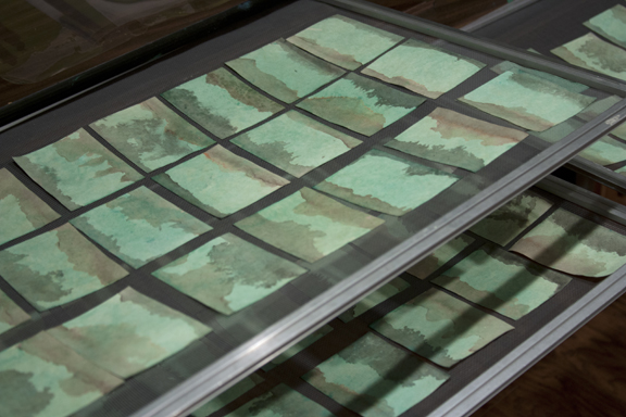
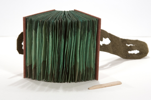
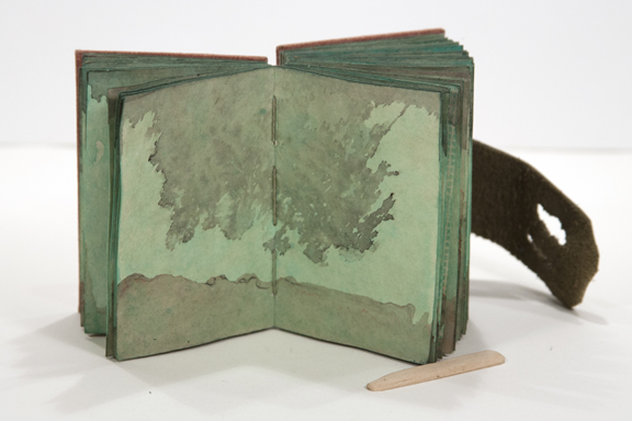
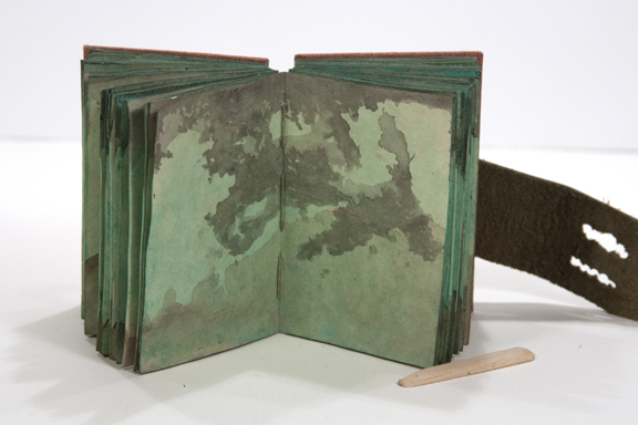
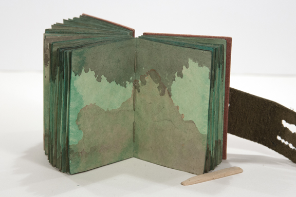
So I dipped each page in a diluted green watercolor bath and dried them on some screens. What I got was not saturated, but it was more interesting. They almost looked like mold growths going through the pages. I was fine with the result as I was looking for a shape that could have occurred in nature. Something that wasn’t exactly planned but I figured might happen was a grid pattern that resulted during the drying process. The green watercolor ink pooled in some places causing the pattern of the drying screen to remain after the pages dried. I am happy with the effect. It speaks to an attempt at controlling the nature of things…sometimes not coming out successfully.
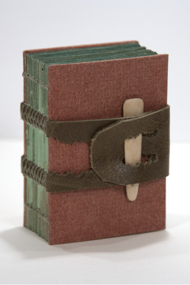
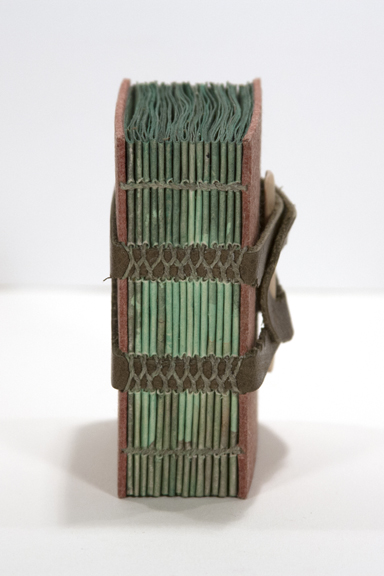
Next, was to determine the binding method and cover materials. I had been given a lovely rust colored flax paper that I knew I wanted to used for the cover. I knew I wanted to sew the pages onto some sort of leather tapes that matched the color scheme of the pages too. I ended up using a piece of scrap leather that was cut to fit the sewing stations providing two tapes for support.
Using a Japanese screw punch, I cut out pieces of the leather to make it match the blotchy interior pages. It is kept closed with a wooden peg made from a shaped and cut Popsicle stick.
Overall, I think the book gives an earthy, damp and active feel. However, I think that my response to the book will change according to the mood of the viewer.
