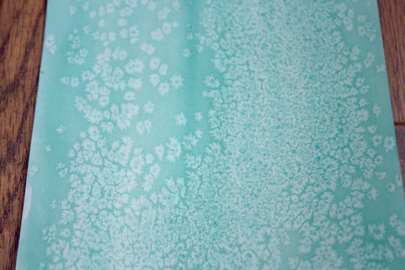
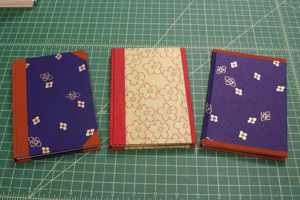
Another day of testing and I have finally settled on the ratio of ingredients as well as a color for the final prints. Going back and forth between the first and second results, I tried some dilute paint on the paper. This was not exactly the solution, because the problem that arose with that mixture was the lack of visible pigment. So when the reaction of the salt with the water happened, the design wasn’t visible.
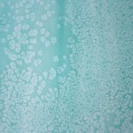
However, I looked again at the first trial…beginner’s luck seemed to be the only conclusion then. Thinking more about it though, I tried to duplicate that print by not mixing the paints and just using a one color as well as keeping it rich. This worked! I am certain that more trials would help figure out how to use the mixed paints to achieve a satisfactory end, but I was really happy with the way that one color turned out. So it is with this one that I made enough for my Set of 6. Since I decided to use just one color for all 6 books, I sprinkled the salt in a few different ways to give a variety of surface design.
Next, is to address the second portion of cover design. Using the less successful prints from before, I tried a few things out. You can look forward to those experiments in a future post…
